Answers not Information – personalizing online government service
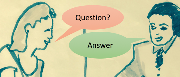
Imagine a wonderful new government service centre where you walk up to a clerk who starts telling you all the information they have until you stop them at the right point. Nah - forget that! Of course, the first thing a service clerk will do is to ask you a question: "What do you need?" or "How can I help you?" That's the very meaning of "Service". Same with a mobile app experience - they skip the information and get right to interaction.
Sadly, many government service tasks online are still based on an information model. This post is about how your design team can get closer to that in-person service-model by using questions and interaction instead of information and links. The ideas, evidence and design patterns arose out of research evidence from projects to improve top task success on the Canada.ca site.

People direct their attention to questions - they want to interact online
People know their attention capacity is limited, so they spend it carefully. They decide what to look at, what to read, and what to click based on models of how those actions will serve them in their goal. Research across a range of topics has shown that people direct their attention to questions instead of reading text, particularly online. I believe it's because people know the questions will help them - that questions produce answers.
Questions distil personal meaning from prose
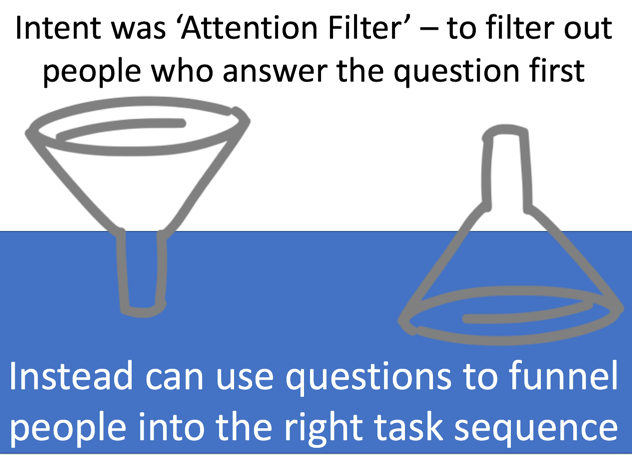
One set of studies is about Attention Filters, where instructions are displayed above a question - the instructions say to ignore the question. It's fun to start with this in my talks, since most of the audience quickly raises their hands to answer the question and sheepishly laughs when I start reading the instructions. This device was designed to filter out people who go straight to the question, if you turn that on its head, you can see that questions can be used to funnel people into the right path.

For more on Oppenheimer, Meyvis and Davidenko's work on attention filters, see: https://www.linkedin.com/pulse/evidence-really-dont-read-instructions-lisa-fast/
Design patterns: when to use questions and wizards
The Digital Transformation Office hosted a talk in October of 2017 in which I walked through a series of design patterns for using questions and interactive elements. It built upon a talk I had first given at Service Design in Government in London UK in early 2017. Steve Hume of Vation Inc. recorded and produced a full video of the recent talk:
Digital service is interaction
This shift from information to service requires a fundamental change in the mind set of government teams. It's part of a Digital Transformation from online publishing to service design. Finally, it can play a role in building trust in government. Edelman PR has a recommendation for Trust in Canada that simply says "Speak with, not at." Questions are about interacting with the user, rather displaying information at them.
Speak with, not at - Trust in Canada
The presentation slides can be viewed on SlideShare and the presentation video is on YouTube
- For more on improving your top tasks on Canada.ca, see the Content and Information Architecture Specification
- Many thanks to Peter Smith, Allen Pink, Eric Cooper and the entire Digital Transformation Office at the Treasury Board of Canada Secretariat. Follow us on Twitter at #CanadadotCa
Copyright ©2017 Lisa Fast
Tagged with:
